Author: Léo M.
What You Will Learn:
The shade of carpet plays a key role in the work atmosphere and identity of your company. This article will guide you in selecting the right carpet color based on the size of the spaces, brightness, industry sector, and the influence of colors on your employees. Discover how to enhance your premises with the ideal carpet color!
Choosing the right carpet color in a professional environment is crucial for creating a pleasant, productive workspace that aligns with your company's image. Whether for offices, meeting rooms, or reception areas, here’s a guide to help you make the right choice for your premises.
The Importance of Carpet Color in Business
Psychological Impact of Colors on Employees
Colors play a crucial role in how employees perceive their mood and productivity, with certain shades capable of enhancing focus and creativity, while others induce feelings of calm and energy. Understanding the meanings of different colors and their effects in the workplace can help create a more supportive environment for your team. The choice of carpet color can significantly influence how employees feel in their workspace.
Influence of Colors on Clients and Visitors
The first impression of clients and visitors in a business is often crucial, and colors play an essential role in this perception. The choice of carpet color can influence a company's brand image and shape how its clients perceive it.
Thus, the color of the carpet goes beyond mere decorative appeal: it becomes a strategic tool to enhance the atmosphere, promote productivity, and provide a positive experience for visitors.
👉 Also Read: Why Install Carpet in Your Offices?
Adapting Carpet Color to the Size and Brightness of the Room
The size and brightness of rooms strongly influence the choice of carpet color. These elements play a key role in optimizing space and the overall ambiance of professional environments.
Dark Spaces
For small or poorly lit spaces, choose light colors like beige, light gray, or pastel blue. These colors create an impression of enlargement and better reflect natural light, making the room brighter and more open. Light carpet color shades also make small spaces feel more welcoming and less cramped, improving comfort and the sense of space.
-1.webp?width=500&height=268&name=photos%20esapces%20sombre%20Web%20P%20(500%20x%20268%20px)-1.webp)
Bright Spaces
In large, well-lit spaces, you can afford darker colors such as navy blue or anthracite gray. These shades add depth and sophistication while balancing the light to avoid an overly bright or impersonal ambiance. Dark carpet color choices provide elegance and modernity while reducing the visibility of wear in large spaces.
%20Web%20P.webp?width=500&height=268&name=photos%20articles%20Blog%20%20(500%20x%20268%20px)%20Web%20P.webp)
Choosing Carpet Color Based on the Space

The choice of carpet color is essential for defining the ambiance of professional spaces. By adapting the color to the function of each area, you can optimize the atmosphere and foster comfort and productivity.
Creative Spaces
For brainstorming rooms and collaboration spaces, favor vibrant colors like orange, yellow, or turquoise. These stimulating shades promote creativity and energy, creating an environment conducive to idea exchange and innovation.
Offices and Quiet Areas
For individual offices or meeting rooms, opt for soft colors such as light gray, beige, or pale blue. These calming shades promote concentration, reduce distractions, and contribute to a serene environment conducive to deep work.
Reception Areas
In entry halls and reception areas, where first impressions are crucial, elegant colors like dark blue, emerald green, or anthracite gray reflect your company’s professionalism. These sophisticated carpet color choices create a welcoming atmosphere, reinforcing brand image and leaving a positive impression upon entry.
Criteria for Choosing Your Carpet Color
Industry Sector and Type of Business
The type of business and industry sector influence the choice of carpet color.
- For tech companies, bright colors like red and orange are often chosen to stimulate creativity and inspiration.
- Insurance companies and conservative sectors, such as finance or law, prefer sober shades like blue, gray, or beige to create a reassuring atmosphere.
- In offices and workspaces, calming colors like blue and green help with concentration and reduce stress. Neutral shades provide an elegant and timeless base.
- In commercial spaces, bright colors attract attention and encourage purchases. In contrast, luxury boutiques opt for dark shades, adding a touch of sophistication and prestige.
Brand Image and Visual Communication
The carpet color should reflect the company’s brand image and align visual communication with its values. Clients and visitors form a first impression based partly on the environment they encounter.
Additionally, it is beneficial to coordinate the carpet color with the colors of the company logo and communication materials to reinforce visual coherence and a sense of belonging. For instance, a company with a blue and green logo might incorporate these colors into its carpet to maintain its visual identity.

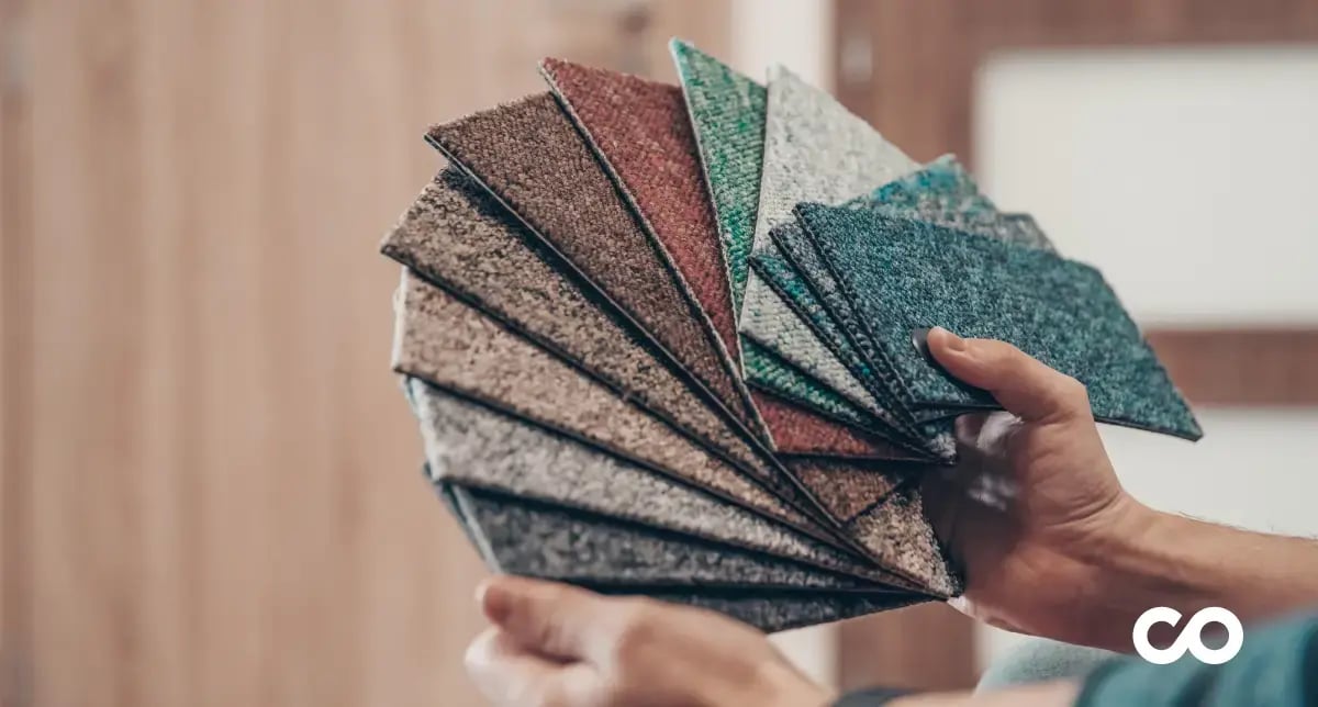
Different Types of Carpet Colors
The choice of carpet color can transform the atmosphere of a professional space. Here’s an overview of the main types of colors to consider:
Light Colors
Carpet tiles in light shades, such as off-white, beige, or light gray, are ideal for creating a bright and spacious environment. They are particularly suited for small spaces or rooms lacking natural light, as they reflect light and visually enlarge the space. Furthermore, these shades convey a sense of cleanliness and serenity, making them ideal for sectors like health or wellness.
%20Web%20P.webp?width=500&height=268&name=photos%206%20articles%20Blog%20%20(500%20x%20268%20px)%20Web%20P.webp)
Bright Colors
Bright colors like red, orange, electric blue, or lemon green are perfect for injecting energy into your spaces. They are ideal for collaboration areas, break rooms, or open spaces where creativity and innovation are encouraged. Bright carpet tiles create dynamic and stimulating spaces.
Web%20P.webp?width=500&height=268&name=photos%20articles%20Blog%20%20(500%20x%20268%20px)Web%20P.webp)
Neutral Colors
Neutral shades like gray, brown, or taupe are the most versatile and timeless. They provide elegance while being easy to match with various styles of furniture and décor. Neutral colors are also excellent for hiding stains and wear in high-traffic areas.
Regardless of the chosen color, adapting the carpet to the desired ambiance and the function of the space can enhance both visual comfort and the effectiveness of the work environment.
BB.webp?width=500&height=268&name=photos%20articles%20Blog%20%20(500%20x%20268%20px)BB.webp)
Composil: Your Partner for Revamping Your Professional Spaces
At Composil, we understand that a well-chosen carpet transforms your workspace. Our specialists guide you in selecting colors that reflect your brand and support the well-being of your employees. Whether you want to energize a creative space or bring clarity to an office, we are here for you.
Why Choose Composil?
✅ Personalized advice based on an analysis of your spaces and needs.
✅ A wide range of colors and materials suited to each sector.
✅ Products combining durability, aesthetics, and ease of maintenance.
✅ Over 30 years of experience in carpet services.
Ready to transform your professional spaces? Explore our online shop now to discover our collections or contact our experts for a tailored consultation.
Conclusion :
Choosing the right carpet color for your professional spaces is not just an aesthetic question. It’s about creating functional and pleasant work environments that contribute to your company’s performance and reputation.
Here are five key points to remember:
- Consider the size and brightness of the room: Light colors visually enlarge small dark spaces, while darker colors add depth to large bright rooms.
- Adapt carpet color to the function of the space: Choose dynamic shades for creative areas and more calming colors for quiet spaces.
- Prioritize durability and maintenance: In high-traffic areas, darker and neutral shades are ideal for hiding wear and simplifying upkeep.
- Ensure coherence with your visual identity: Integrate the colors from your graphic charter into your carpet choices to reinforce your brand image.
- Select tile colors based on the desired effect: Light colors for brightness, bright colors for energy, and neutral shades for elegance and durability.